Monday, May 2, 2016
What is the best format for publishing your Family Tree chart?
Charting Companion offers many options for telling the story of your family.

Print your family tree on a 3D printer
3D printers use melted plastic or fused resin to create objects in every shape imaginable. 3D printers are becoming popular as the technology improves and prices come down.
Charting Companion
now includes an option to output Ancestor and Descendant Fan charts as
"STL" files, which can be fed to 3D printers for printing as physical
objects.
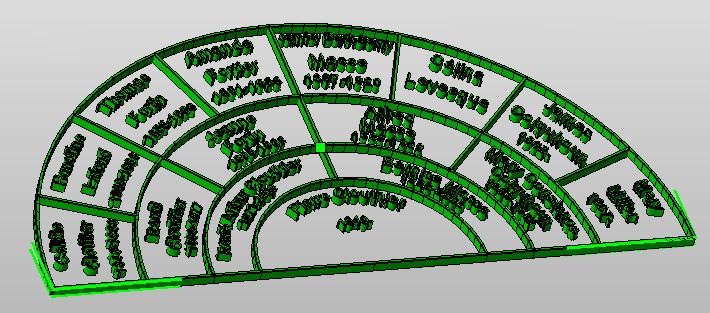
Preview of 3D Fan chart
3D
printers range in size and price from small, desk-top units, to large
industrial machines. Schools and libraries are now offering 3D printing
facilities. 3Dhubs.com
is a network of 3D print shops all over the World where you can email
your 3D print file, and receive a fabricated piece in a few days.

Typical 3D printers
3D
printing is still in its infancy. Low-cost desktop units have a low
resolution and small base plate size. Finer resolution and larger pieces
require high-end, industrial-grade machines. 3D printers aimed at the
consumer market are limited to three-generation Fan charts. A
five-generation Fan chart is best done with 8" diameter.
If you haven't already upgraded, click to get the latest version of Charting Companion 6. A 3D printed family tree lasts forever, and makes a great gift idea. Share your story with your family and friends. Click for more information.
Ancestor chart, "Bottom-up" style
Charting Companion now prints the Ancestor chart in vertical or "Bottom-up" style.
Many
of you have requested this option, and we are pleased to provide you
with another attractive way of telling the story of your family.
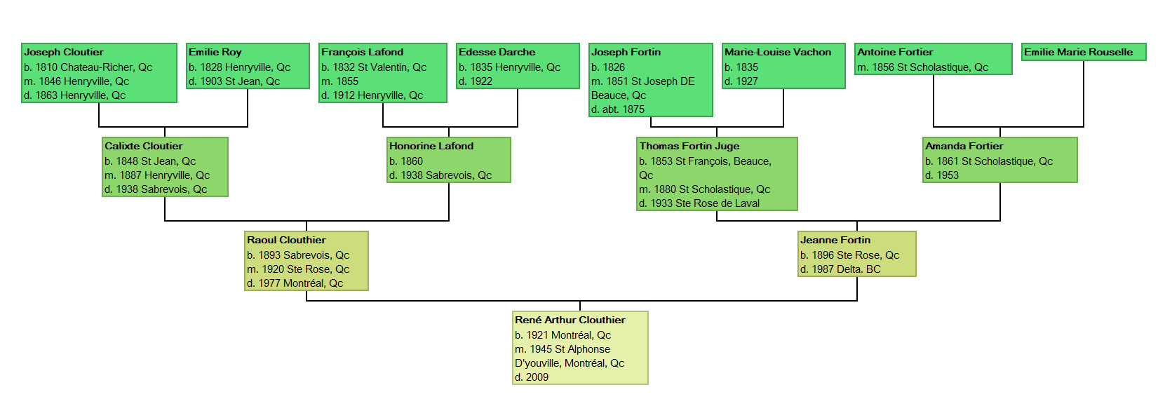
Preview of Ancestor "Bottom-up" vertical format
New Event Type selection for Charting Companion
Charting Companion now allows you to pick specific event types in your Ancestor and Descendant charts.
Many
of you have requested this option, and we are pleased to provide you
with another convenient way of telling the story of your family. Get your copy of Charting Companion version 6: click to buy a Registration Key.
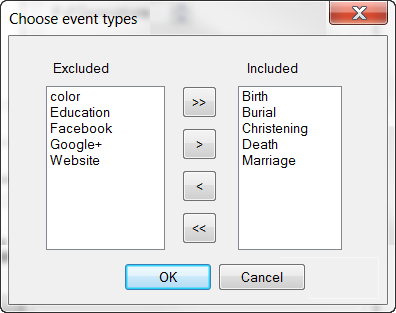
Preview of Event Type selection
You
can tailor your chart by specifying the exact mix of events that you
would like to see for each person. Click on the list of events in the
Chart Options dialog, and the dialog above appears. Click on an event in
the "Excluded" column, click on the move ">" button; the event will
appear in the "Included "column, and on your chart.
Don't forget that you can publish your chart in HTML format; the social media links become "clickable", to launch each person's Facebook page or Twitter feed.
Don't miss out on this colorful way of celebrate your family history: buy Charting Companion. We are honored to be part of your story.
Wednesday, April 20, 2016
Improving Charting Companion with GDI+
A Windows program uses GDI (Graphical Device Interface) to create graphics. GDI is a great invention that enables the programmer to easily mix text, raster (photos) and vector (drawings) graphics in the same output. GDI is what allows a Windows program to display the same thing to a screen and a printer (know as WYSIWYG, or "What you see is what you get").
GDI was introduced in 1985 with Windows 1.0. Windows XP was released in 2001 and featured GDI+, an improvement over GDI including anti-aliasing, gradients, built-in support for image files (JPG, GIF, PNG), transparency & color blending, and better display of text characters.
Antialiasing is a software technique for diminishing jaggies - stairstep-like lines that should be smooth. Jaggies occur because the output device, the monitor or printer, doesn't have a high enough resolution to represent a smooth line.
Antialiasing reduces the prominence of jaggies by surrounding the stairsteps with intermediate shades of gray (for gray-scaling devices) or color (for color devices). The pixels that surround the edges of the line are changed to varying shades of gray or color in order to blend the sharp edge into the background.
Here is a before & after example:
Here is what it looks like at scale:
This what it looks like for text:
You can see how the un-aliased text is jagged and crotchety:
We are improving Charting Companion by converting the GDI graphics to GDI+. Users will see an improvement in the quality of the text and lines. Displaying photos with GDI+ will also free us from a third-party library whose licensing model has become exorbitant.
We hope to bring you these enhancements soon, so you can tell the story of your family ever so attractively.
GDI was introduced in 1985 with Windows 1.0. Windows XP was released in 2001 and featured GDI+, an improvement over GDI including anti-aliasing, gradients, built-in support for image files (JPG, GIF, PNG), transparency & color blending, and better display of text characters.
Antialiasing is a software technique for diminishing jaggies - stairstep-like lines that should be smooth. Jaggies occur because the output device, the monitor or printer, doesn't have a high enough resolution to represent a smooth line.
Antialiasing reduces the prominence of jaggies by surrounding the stairsteps with intermediate shades of gray (for gray-scaling devices) or color (for color devices). The pixels that surround the edges of the line are changed to varying shades of gray or color in order to blend the sharp edge into the background.
 |
| Raw vs. Antialiased vs.line |
Here is a before & after example:
 |
| Antialiasing makes smoother and better lines |
Here is what it looks like at scale:
 |
| Un-aliased & antialiased letter |
This what it looks like for text:
 |
| Antialiased text is smoother and looks better |
You can see how the un-aliased text is jagged and crotchety:
We are improving Charting Companion by converting the GDI graphics to GDI+. Users will see an improvement in the quality of the text and lines. Displaying photos with GDI+ will also free us from a third-party library whose licensing model has become exorbitant.
We hope to bring you these enhancements soon, so you can tell the story of your family ever so attractively.
Subscribe to:
Posts (Atom)